Wednesday, September 02, 2015
Tokyo Olympic Logo Suggestion
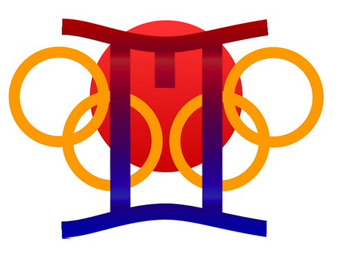
The above would be my entry for the Tokyo Olympic Logo competition. The last one which was withdrawn looked too Western and had no continuity with the previous Tokyo Olympic logo. As some one has said of the stadium, the Japanese should highlight their tendency to reflect and improve. It is this tendency that is expressed in the above logo, using elements from the previous Tokyo Olympics logo which was the "round sun" of the Japanese flag above the Olympic logo with the rings turned to Gold. This time the Round sun has been integrated with the other rings, to suggest the greater integration of Japan with the rest of the world, the gradient has been reversed to suggest a new dawn, and both have been superimposed with a "T" for Tokyo and the Roman numeral for 2, made to resemble the red iconic gate in the Miyajima Island bay in Hiroshima, reflected in the blue water. I have avoided adding a second horizontal lintel (bar) so as not to push the religious symbolism. I.e. the above can not be said to be Shinto mark.
The twin lintelled gate (torii) is a religious symbol but logos closely or vaguely resembling religious symbols have been used at Albertville (a Christian Cross) and the Seoul Olympics (a spiral reminiscent of the Taoist tomoe). Added to that, Shinto is an extremely inclusive religion, allowing of the enshrinement of Christian and Taoist Gods, and above all, the symbol simply represents the beauty of Japan, and the Japanese tendency to reflect and improve, rather than any religion.
Above all, I think that the Japanese should be brave and highlight their own culture rather than just a Western typeface. The above is the sombre version. A brighter version and the original idea are also uploaded. The five rings are copyright the International Olympic Committee, the use of a gradient round sun and gold rings was inspired by the previous logo of the 1964 Olympics by Yusaku Kamekura. Other than that, this is all my own work.
The central stem of the T could be a little longer.
This blog represents the opinions of the author, Timothy Takemoto, and not the opinions of his employer.